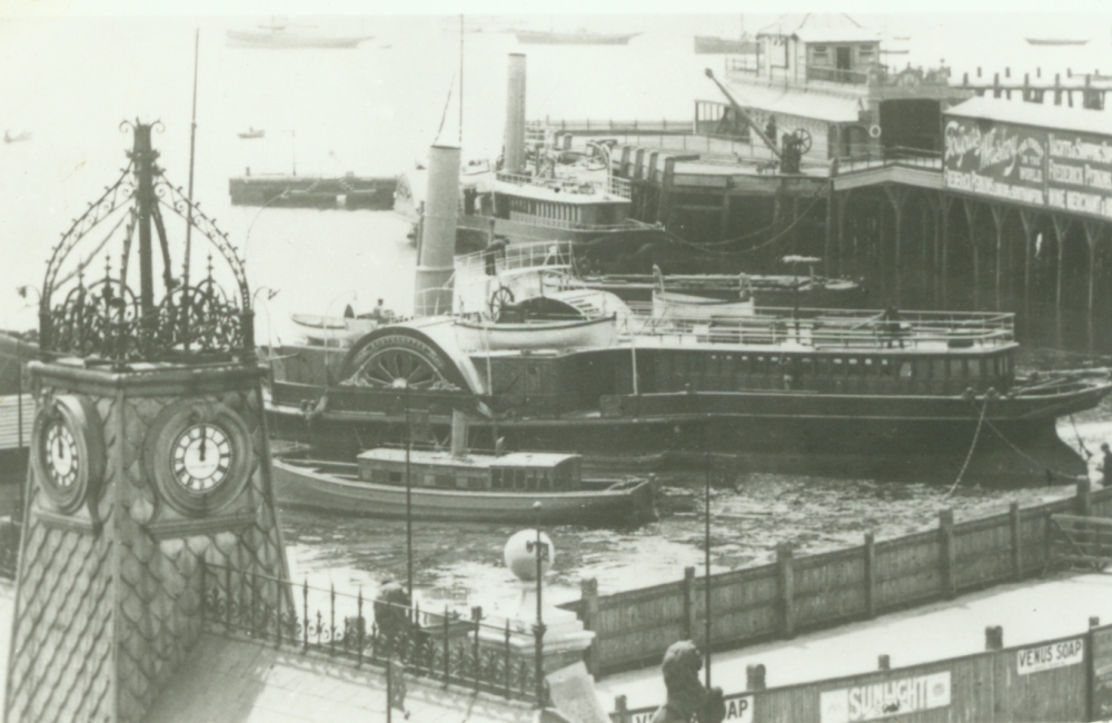
For well over half a century, Red Funnel's fleet, as the name implies, carried the famous red funnel topped off in black. However, until the 1930's the funnels of the packet steamers were painted a fashionable buff colour.
A white funnel appeared for the first time in 1900 with the arrival of Balmoral I, and other steamers used for excursion work (Lorna Doone, Bournemouth Queen) were also given white funnels.
After the acquisition of the Bournemouth & South Coast Steam Packets Ltd in 1908, the three Bournemouth based steamers retained their red funnels and black tops until WWI, reverting thereafter to the normal packet service livery.
In 1931 a black top was applied to the entire fleet and the buff packet livery was dropped the following year in favour of white with black topped smoke stacks. The reason, to avoid confusion with the Southern Railway Isle of Wight Steamers which also had buff funnels. In 1935, the famous red funnel and black top was uniformly adopted to differentiate the Company's steamers from vessels belonging to James Dredging & Contracting Co. Ltd and the name Red Funnel was born.
The vessels themselves had black bottoms and a cream and later white, superstructure. The first stage of a new corporate identity was applied in 1991. The Company's new Hi-Speed catamarans emerged with black bottoms, red hulls and white upper decks with a grey side band. The Company's Solent logo was applied to the sides and included the strap line "Isle of Wight Ferries".
The final stage of the re-branding exercise was unveiled to the media and public in 1994 to coincide with the launch of the first new 'Raptor' class ferries. Apart from the new vessel colour scheme, black bottoms, red hulls, white upper decks with a grey side band and black Red Funnel name and strap line, a new logo was revealed.
Drawing heavily on the Company's heritage, the new funnel logo, designed by Interbrand, was extremely well received. The traditional paddle steamer funnel was stylized with a 3D effect and instead of black smoke pouring from the funnel, in this environmental age the connection was made using a blue cloud device. The font chosen for the Red Funnel name aims to demonstrate maturity and professionalism and by using the strap line "The Original Isle of Wight Ferries", there is no doubting the historical connection. The new colours were applied across the fleet and all stationery and consumer literature bore the new branding.
Logo History
Up to 1899
Buff funnels, black hulls, red bottoms, grained deckhouse.
1900-1908
Lorna Doone, Balmoral and Bournemouth Queen had white superstructure and white funnels.
1909-1914
Bournemouth Queen and the Swanage steamers had red funnels and black tops. Lorna Doone, Balmoral and later the Bournemouth Queen had white funnels. The packet service steamers had buff funnels.
1919-1930
Solent Queen has a white funnel. Other Southampton steamers had buff funnels.
1931
Black tops added to all the funnels.
1932-1934
All funnels become white with black tops.
1935
All funnels become red with black tops, upperworks cream, black hulls.
1969
For the first time a Company logo was designed and applied to the new hydrofoils that were entering service.
1974
"Red Funnel Services" was painted in large letters on the sides of the vehicle ferries.
1985
Magnolia upperworks, with red lines between two narrow white lines at the top of the black hull.
1991
Black bottoms, red hulls, white superstructure, grey side band, red Solent logo and lettering.
1994
New corporate logo and colour scheme of red funnels, black tops, red hulls, white superstructure, grey side band, black logo lettering that included the strap line "The Original Isle of Wight Ferries".


